Layout & Organization
The Box Model
Every HTML element is a rectangular box. The CSS box model consists of:
- Content — the actual text or image
- Padding — space between content and border
- Border — the edge around the element
- Margin — space outside the border
div {
  width: 300px;
  padding: 20px;
  border: 2px solid #333;
  margin: 16px;
}
Display Properties
Elements can be displayed in different ways:
display: block;      /* Takes full width, starts new line (div, p, h1) */
display: inline;     /* Fits within text (span, a, strong) */
display: inline-block; /* Inline but can have width/height */
display: none;       /* Hidden, removed from layout */
Flexbox Layout
Flexbox makes it easy to align items in rows or columns:
.container {
  display: flex;
  justify-content: center;  /* horizontal alignment */
  align-items: center;      /* vertical alignment */
  gap: 16px;                /* space between items */
  flex-wrap: wrap;          /* wrap to next line */
}

.item {
  flex: 1;                  /* grow equally */
  min-width: 200px;
}
CSS Grid Layout
Grid creates two-dimensional layouts:
.grid {
  display: grid;
  grid-template-columns: 1fr 1fr 1fr;  /* three equal columns */
  gap: 20px;
}

.header { grid-column: 1 / -1; }  /* span full width */
.sidebar { grid-column: 1 / 2; }
.main { grid-column: 2 / 4; }
Responsive Design with Media Queries
Media queries adapt your layout to different screen sizes:
/* Default: mobile-first styles */
.container { width: 100%; padding: 10px; }

/* Tablet: 768px and up */
@media (min-width: 768px) {
  .container { width: 750px; margin: auto; }
}

/* Desktop: 1024px and up */
@media (min-width: 1024px) {
  .container { width: 960px; }
}
Positioning
position: static;    /* Default flow */
position: relative;  /* Offset from normal position */
position: absolute;  /* Relative to nearest positioned ancestor */
position: fixed;     /* Relative to viewport (stays on scroll) */
position: sticky;    /* Toggles between relative and fixed */
Common Layout Patterns
Holy Grail Layout
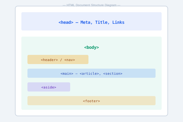
<header>Header</header>
<div class="middle">
  <nav>Left sidebar</nav>
  <main>Main content</main>
  <aside>Right sidebar</aside>
</div>
<footer>Footer</footer>
Practice Task
Create a responsive page layout with:
- A header with a site title
- A navigation bar with 3 links (use Flexbox)
- A main content area and a sidebar (use CSS Grid)
- A footer
- Make it responsive: stack vertically on mobile (media query at 768px)