CSS Grid
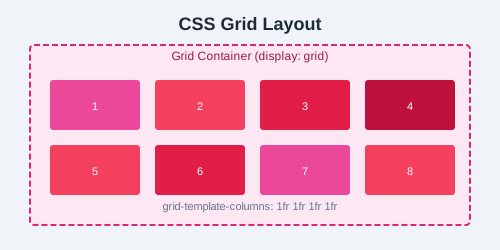
CSS Grid is a two-dimensional layout system that lets you control both columns and rows at the same time. While Flexbox excels at one-dimensional layouts, Grid is the tool for building full page layouts and complex grid systems.
Setting Up a Grid Container
.grid-container {
  display: grid;
}
Grid Template Columns & Rows
Define the size and number of columns and rows.
.grid {
  display: grid;
  grid-template-columns: 200px 200px 200px;
  grid-template-rows: auto 200px;
}

/* Fractional units — flexible sizing */
.grid {
  grid-template-columns: 1fr 2fr 1fr;
}

/* Repeat function */
.grid {
  grid-template-columns: repeat(3, 1fr);
}

/* Mix fixed and flexible */
.grid {
  grid-template-columns: 250px 1fr 1fr;
}
The Gap Property
.grid {
  display: grid;
  grid-template-columns: repeat(3, 1fr);
  gap: 16px;
  row-gap: 20px;
  column-gap: 12px;
}
Grid Item Placement
Grid Column & Row
.header {
  grid-column: 1 / -1;  /* span all columns */
}

.sidebar {
  grid-row: 2 / 4;      /* span rows 2 through 4 */
}

.main {
  grid-column: 2 / 4;   /* span columns 2 and 3 */
  grid-row: 2 / 3;
}
Grid Area
.layout {
  display: grid;
  grid-template-columns: 200px 1fr;
  grid-template-rows: auto 1fr auto;
  grid-template-areas:
    "header header"
    "sidebar main"
    "footer footer";
  gap: 8px;
}

.header  { grid-area: header; }
.sidebar { grid-area: sidebar; }
.main    { grid-area: main; }
.footer  { grid-area: footer; }
Alignment in Grid
.grid {
  display: grid;
  grid-template-columns: repeat(3, 100px);
  grid-template-rows: repeat(2, 100px);

  /* Align items inside their cells */
  justify-items: center;
  align-items: center;

  /* Align the entire grid inside the container */
  justify-content: center;
  align-content: center;
}

/* Per-item alignment */
.item {
  justify-self: end;
  align-self: stretch;
}
Building a 12-Column Layout System
.row {
  display: grid;
  grid-template-columns: repeat(12, 1fr);
  gap: 16px;
}

.col-3  { grid-column: span 3; }
.col-4  { grid-column: span 4; }
.col-6  { grid-column: span 6; }
.col-8  { grid-column: span 8; }
.col-12 { grid-column: span 12; }

/* Responsive columns */
@media (max-width: 768px) {
  .col-3, .col-4, .col-6, .col-8 {
    grid-column: span 12;
  }
}
Auto-fit vs Auto-fill
/* auto-fit — collapses empty tracks */
.grid-fit {
  display: grid;
  grid-template-columns: repeat(auto-fit, minmax(250px, 1fr));
}

/* auto-fill — preserves empty tracks */
.grid-fill {
  display: grid;
  grid-template-columns: repeat(auto-fill, minmax(250px, 1fr));
}
Key Difference:
auto-fit collapses empty tracks to zero width, letting items stretch. auto-fill keeps empty tracks at their defined size, preserving the grid structure even with fewer items.
Practice Task: Create a responsive blog layout using CSS Grid with a header, footer, main content area (spanning 8 columns), and a sidebar (spanning 4 columns). On mobile screens (below 768px), stack everything into a single column.