Flexbox
Flexbox is a one-dimensional layout model that distributes space and aligns content within a container. It makes it easy to design flexible, responsive layouts without floats or positioning tricks.
The Flex Container
To create a flex layout, set display: flex on the parent element. The direct children become flex items.
.container {
  display: flex;
}
Flex Direction
Controls the direction flex items are placed in the container.
.row { flex-direction: row; }           /* default */
.column { flex-direction: column; }
.row-reverse { flex-direction: row-reverse; }
.column-reverse { flex-direction: column-reverse; }
Flex Wrap
By default flex items try to fit on one line. Use flex-wrap to allow wrapping.
.wrap { flex-wrap: wrap; }
.nowrap { flex-wrap: nowrap; }    /* default */
.wrap-reverse { flex-wrap: wrap-reverse; }

/* Shorthand */
.container { flex-flow: row wrap; }
Justify Content — Main Axis Alignment
.start    { justify-content: flex-start; }    /* default */
.end      { justify-content: flex-end; }
.center   { justify-content: center; }
.between  { justify-content: space-between; }
.around   { justify-content: space-around; }
.evenly   { justify-content: space-evenly; }
Align Items — Cross Axis Alignment
.stretch  { align-items: stretch; }    /* default */
.start    { align-items: flex-start; }
.end      { align-items: flex-end; }
.center   { align-items: center; }
.baseline { align-items: baseline; }
Align Content — Multi-line Alignment
Works when there are multiple rows of flex items (requires flex-wrap: wrap).
.container {
  display: flex;
  flex-wrap: wrap;
  align-content: space-between;
}
The Gap Property
Creates spacing between flex items.
.container {
  display: flex;
  gap: 16px;
  row-gap: 12px;
  column-gap: 24px;
}
Flex Item Properties
Flex Grow
Controls how much an item should grow relative to siblings.
.item { flex-grow: 1; }    /* all items grow equally */
.sidebar { flex-grow: 0; } /* stays at its base size */
.main { flex-grow: 2; }    /* grows twice as much */
Flex Shrink
Controls how much an item should shrink when there isn't enough space.
.item { flex-shrink: 1; }  /* default */
.no-shrink { flex-shrink: 0; }
Flex Basis
Sets the initial main size of a flex item before growing or shrinking.
.item { flex-basis: 200px; }The Flex Shorthand
.item {
  flex: 1;              /* flex-grow: 1, flex-shrink: 1, flex-basis: 0 */
}

.item {
  flex: 0 0 auto;       /* default */
}

.item {
  flex: 1 0 300px;      /* grow, don't shrink, start at 300px */
}
Align Self
Overrides the container's align-items for a single item.
.item {
  align-self: flex-end;    /* or auto | flex-start | center | baseline | stretch */
}
Order
Controls the visual order of flex items (default is 0).
.first { order: -1; }
.last  { order: 1; }
Responsive Flexbox Patterns
.card-grid {
  display: flex;
  flex-wrap: wrap;
  gap: 16px;
}

.card-grid > * {
  flex: 1 0 250px; /* grow, don't shrink, min 250px */
}

/* Holy Grail layout */
.layout {
  display: flex;
  flex-direction: column;
  min-height: 100vh;
}

.layout main {
  display: flex;
  flex: 1;
}

.layout main article { flex: 1; }
.layout main nav     { flex: 0 0 200px; }
.layout main aside   { flex: 0 0 200px; }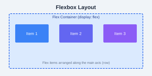
justify-content: space-between and align-items: center.