Box Model
What is the Box Model?
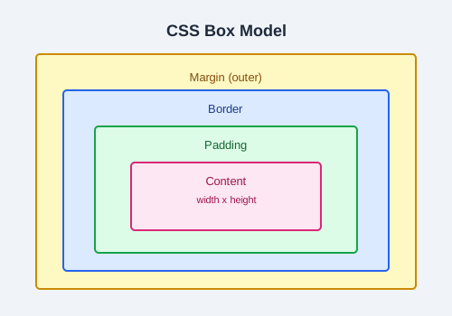
Every element in CSS is a rectangular box. The box model describes how the size of each element is calculated from four layers: content, padding, border, and margin.
The Four Areas
- Content — the actual text or image.
- Padding — space between content and border.
- Border — the edge around the padding.
- Margin — space outside the border.
box-sizing
The box-sizing property controls how width and height are calculated.
content-box (default)
Width and height only apply to the content area. Padding and border add to the total size.
div {
  box-sizing: content-box;
  width: 200px;      /* content width */
  padding: 20px;     /* adds 40px total */
  border: 2px solid; /* adds 4px total */
  /* total width: 244px */
}
border-box
Width and height include content, padding, and border. This makes sizing much easier.
div {
  box-sizing: border-box;
  width: 200px;      /* total width */
  padding: 20px;
  border: 2px solid;
  /* content width: 156px */
}
Best practice: Set
box-sizing: border-box on all elements with the universal selector to simplify layout math:
*, *::before, *::after {
  box-sizing: border-box;
}
Margin Collapse
When two vertical margins meet, the larger margin wins. They do not add together.
h1 { margin-bottom: 30px; }
h2 { margin-top: 20px; }
/* The gap between them is 30px, not 50px */
Block vs Inline Boxes
- Block elements take the full width available and start on a new line.
- Inline elements take only as much width as needed and flow within text.
Practice Task
Create two <div> elements side by side. Set each to width: 50% with box-sizing: border-box and add padding and borders. Observe how border-box keeps them on the same line.