JSX & Components
What is JSX?
JSX stands for JavaScript XML. It is a syntax extension for JavaScript that allows you to write HTML-like code directly inside your JavaScript files. JSX makes React code more readable and expressive by combining the markup with the logic that renders it.
// JSX syntax example
const element = <h1 className="greeting">Hello, React!</h1>;
JSX Rules
- Single Root Element: JSX expressions must have one parent element. Use a
<div>or a React Fragment (<></>) to wrap multiple elements. - Close All Tags: Every tag must be closed, including self-closing ones like
<img />and<br />. - className Instead of class: Since
classis a reserved word in JavaScript, React usesclassNamefor CSS classes. - CamelCase Properties: HTML attributes like
onclickbecomeonClick,tabindexbecomestabIndex.
// Correct JSX with multiple elements
function Welcome() {
  return (
    <>
      <h1>Hello!</h1>
      <p>Welcome to React.</p>
    </>
  );
}
JavaScript Expressions in JSX
You can embed any JavaScript expression inside JSX by wrapping it in curly braces { }. This includes variables, function calls, and mathematical operations.
const name = "Alice";
const age = 25;
const element = (
  <div>
    <p>Name: {name}</p>
    <p>Age: {age}</p>
    <p>Next year: {age + 1}</p>
  </div>
);
Functional Components
In modern React, components are written as JavaScript functions. A functional component is a function that accepts a props object as an argument and returns JSX. Functional components are simpler, easier to test, and with hooks they can manage state and side effects just like class components.
// A simple functional component
function Greeting(props) {
  return <h1>Hello, {props.name}!</h1>;
}

// Arrow function version
const Greeting = (props) => {
  return <h1>Hello, {props.name}!</h1>;
};
Component Composition
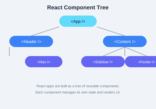
One of React's most powerful features is the ability to compose components by nesting them inside each other. This allows you to build complex interfaces from small, reusable pieces.
function Avatar(props) {
  return <img src={props.src} alt={props.alt} />;
}

function UserInfo(props) {
  return (
    <div className="user-info">
      <Avatar src={props.user.avatar} alt={props.user.name} />
      <h3>{props.user.name}</h3>
    </div>
  );
}

function Comment(props) {
  return (
    <div className="comment">
      <UserInfo user={props.author} />
      <p>{props.text}</p>
    </div>
  );
}
Nested Components
Components can be nested to any depth. The parent component passes data down to its children via props. This creates a clear, predictable data flow that makes your application easier to reason about.
Props
Props (short for properties) are read-only inputs to a React component. They allow data to flow from parent to child components. Props can be strings, numbers, booleans, objects, arrays, functions, or even other components.
// Passing props to a component
const element = <Product title="Laptop" price={999} inStock={true} />;

// Receiving props in the component
function Product(props) {
  return (
    <div>
      <h2>{props.title}</h2>
      <p>Price: ${props.price}</p>
      {props.inStock ? <p>In Stock</p> : <p>Out of Stock</p>}
    </div>
  );
}
Default Exports
React components are typically exported using default exports, allowing them to be imported with any name in other files. This is the standard pattern for single-component files.
// In Greeting.jsx
export default function Greeting() {
  return <h1>Hello!</h1>;
}

// In App.jsx
import Greeting from './Greeting';
Styling Options
- Inline Styles: Use a JavaScript object with camelCase properties.
- CSS Modules: Scoped CSS files that generate unique class names to avoid collisions.
- Styled-Components: A CSS-in-JS library that allows you to write actual CSS in JavaScript.
- Tailwind CSS: A utility-first CSS framework that works well with React.
// Inline styles
const style = { color: 'blue', fontSize: '18px' };
return <p style={style}>Styled text</p>;

// Styled-components
import styled from 'styled-components';
const Button = styled.button`
  background: #3b82f6;
  color: white;
  padding: 8px 16px;
  border: none;
  border-radius: 4px;
`;
Practice Task
Create a ProductCard component that accepts name, price, and image as props. Then create an App component that renders three ProductCard components with different product data. Use inline styles to give each card a border, padding, and margin.